comic book coloring

Interview with Gabriel Cassata

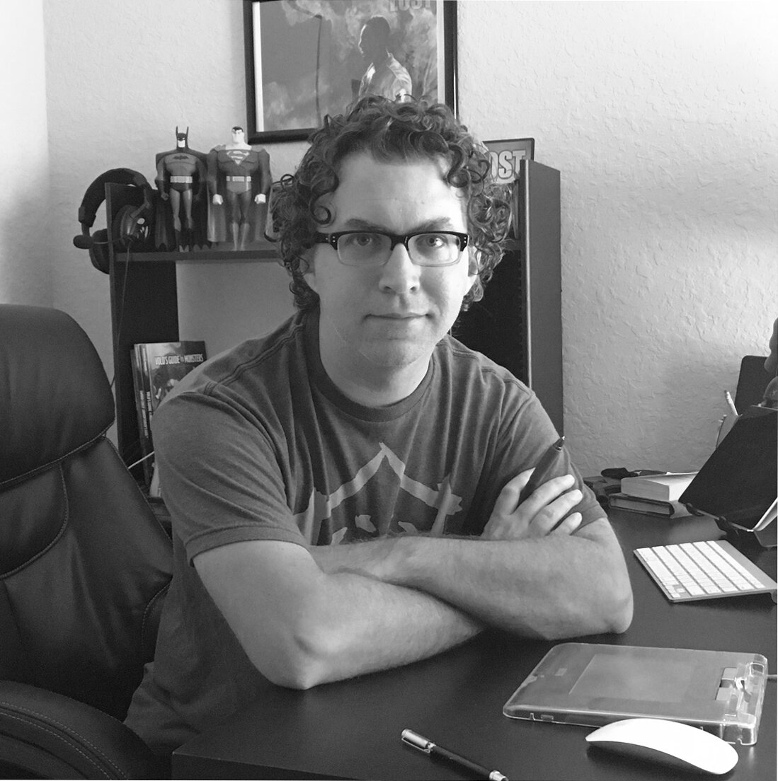
Gabriel Cassata is a freelance artist and professional comic book colorist currently living in central Florida.

His work has been published at Image Comics, BOOM! Studios, DC Comics, IDW and Archie Comics among others. His commercial clients have included Lucasfilm, Verizon, Time Warner Cable, Lego and Honda.

Gabriel_BW.jpg


Gabriel, we have worked on a few books together over the years and it’s always a delight. You have a versatile style, but regardless of rendering, you always seem to pick the perfect colors. How’d you get your start in comics, and did you always want to be a colorist?


No, I just kind of stumbled into it. 


Prior to working full time in comics, I did a lot of visual effects work in Hollywood on a bunch of TV shows and movies. I began as a CG generalist but I quickly discovered that I was getting recognized for my lighting and compositing work. So when I started playing around with coloring pages of line-art I found online as a fun hobby, I realized that all that time spent in VFX was a great training ground for the skills needed to create exciting and compelling comic pages in terms of developing my artist’s eye. And most importantly, it was great fun! I started submitting to publishers and happily began receiving offers. That was about a decade ago and the rest, as they say, is history.        


You’re best known for coloring comics, but you also worked on Marvel’s X-Men game. Can you tell us a little bit about that, and are there any differences to working on a game compared to a comic?


That was one of those ‘blue sky’ jobs as I call them whenever offers seem to just drop out of nowhere. I did a little work on some games in the past but I never worked for Fantasy Flight Games before. An art director there found me and asked if I’d like to provide some illustrations for their new game, X-Men: Mutant Insurrection. So of course I jumped at the chance. 


The biggest difference between creating art for comics and tabletop games is, in comics, we’re mostly concerned with the impact of the full page, specifically storytelling through panel-to-panel sequential images. With games, like traditional illustration, it’s more about a hyper focus on the impact of individual, stand-alone images. Both are rewarding (and challenging) in their own ways. But really, the biggest difference was I was drawing and coloring all the art, which I don’t get to do often. 


What’s the process like working on a game, and how does it compare to comics? Any big differences working with art directors as opposed to editors? One of the things I love about comics is working with a team, do you find that sensation in games?


They have a lot in common from the artist perspective. There’s usually a license holder who has to be satisfied, model sheets for characters and objects to make sure the art team stays on-model and all the usual revisionary back and forth that we know and love from comics. Sadly, the team concept is missing though. I’m one of a dozen disparate artists working independently whose output needs to be on the same page when it’s put together into a cohesive product. That’s the AD’s job and I definitely don’t envy it. It must be like herding cats. But the basic working relationship between artist and art director is nearly identical to comics. Always be nice. Always be professional. Hit your deadlines and you’ll likely get hired again.   


You’ve worked with a lot of publishers. Any favorites? Anybody still on the bucket list? How do you juggle them all, and most importantly does Lego send you free kits?


Honestly, everybody has their horror stories but I’ve had such great experiences working with most publishers. You know the importance of working with a great editorial team. When you find an exceptional Ed. or Asst. Ed., treasure the experience knowing you’re being supported in the best possible way. Eric Harburn at BOOM! gave me my first real comics gig on the series, SUPURBIA, with Russell Dauterman. By the end of that 16-issue run, I knew that I wanted to make a career of it. 


I’ve flirted with Marvel and DC but aside from some small one-off gigs, I’ve yet to fully crack the Big Two. So that’s still clearly on the career bucket-list. But it just goes to show, you can make a stable career out of working for the other guys. It just requires a lot of hustle. I feel like I’m constantly working on maintaining relationships with editors and other pro’s. And I can’t recommend that enough. I’ve booked more gigs due to good reputation and word of mouth than anything. 


I prefer to juggle no more than 3 projects at one time. That seems to be my sweet spot. The key is prioritizing deadlines and I try my best to dedicate any given day’s efforts to only one job. You have to be a good juggler but it works. 


And I’ve yet to receive any free Lego kits! Who do I call about that?         


Can you dive into the nuts and bolts on how you color a page? What’s step one? How do you decide what colors to use? Anytime I color my own work, I feel lost in the spectrum.


The first step for me is reading the entire script from beginning to end. That helps get my head in the vibe of the story and I start ‘pre-coloring’ pages before I even look at the line-art, if that makes sense. I’m making preliminary decisions about tone based purely on the emotional beats of the story. Then when I get to the pages themselves, I usually have to set them up based on a given publishers technical page specs (or at least confirm they’re correct when they get to me). Everybody seems to do it a little differently. And then they’re off to my flatter. When the pages get back from flatting, I try to start from page 1 and work sequentially. That helps me establish the tonal flow and build towards impactful moments. 


I then ‘re-tone’ all the flats as most flatters aren’t concerned with palette, just making separations so finished flats usually look like an explosion at a crayon factory. This initial re-toning helps me create a visual guide for the page. I always like my tonal baseline to begin with the mid-tones. This also helps me stay ‘on-palette’ and avoid any drastic deviations in color that might create a visual speed bump for the reader. Then the hard work is done. All that’s left is the rendering. I work on the whole page at once (not panel by panel). The only time I deviate from this approach is if there is a scene change on a single page. Then I treat them as separate things; fully finishing one scene before starting the other. 


For the rendering, I start by adding shadows to the mid’s, then the highlights, rim lights and bounce lights where necessary. Finally, I add in the post effects (VFX terminology there, I guess) like any glow effects, fog, lighting blooms, etc. Some final cleanup, a quick double-check of the script to make sure I didn’t miss anything and it’s on to the next page.


The color choices I make are really informed by the story. And those all go back to the fundamentals of human nature and how we respond to stimulus. For example, I use warm tones for moments of comfort or passion. Cool tones for scenes of fear or isolation, greens and purples for sickness and unease, etc. That kind of thing. It’s all about reinforcing the emotional connections we want the reader to feel. 


 I try to manage 3-4 pages a day. When deadlines are particularly tight, I shift into overdrive and can do more but, being a new daddy, it’s even more important that I don’t indulge my work-a-holic tendencies too much.


Do you ever get the itch to go back into VFX work?


Not so much. It is a tremendous thrill to see your hard work on screen but I found the creative part of the job takes a backseat to all the technical stuff required to make it happen. My head still hurts from working on the smoke monster from LOST. I’m really proud of the work I did but I started feeling a bit creatively empty. More of a technician than an artist. Comics solved all of those issues and more. I definitely don’t miss those 2-hour, 5-mile LA commutes every day to get to the studio. I much prefer working freelance from a home studio. It opens the door to live pretty much anywhere we want which is nice. I have the freedom to pick and choose the jobs I want to take as opposed to some studio head telling us what we’re working on and hoping we’re into it. Job security is the same performance-based thing that exists in comics but I do miss having all my health insurance and benefits taken care of. Freelance life is like living without a net and it’s definitely not for everybody. It takes a serious work ethic but once you get used to it, it’s very hard to go back.      


I ask everyone I interview…If you could only give one piece of advice, be it for coloring or life, what would it be?      


I think it’s that old thing about following your bliss. Pick a job you love and you’ll never work a day in your life. Not to say there aren’t challenges and tough days but as a creative person, being creatively rewarded in my work (and life) is the most important thing. And it’s never too late to start. Whatever you’re doing in life, whatever situation you’re in; if you’re not happy – you have the power to make the changes to improve your happiness. Don’t worry too much about money. Money will come. If you take care of the work, the work will take care of you. Sounds pithy but it’s true. 


And finally, try not to compare yourself to other people. That road leads to frustration, self loathing and will eventually bury the things that make you unique and special as you tend to alter your creative instincts to look like someone else. Just focus on doing your thing. Even if you’re not seeing the success you want to right now, at least you’ll be uniquely you, not just a clone of [insert name of well known artist here].


Oh, and never read reviews. As tempting as the prospect of public validation is, they will mess with your steering. Even the good ones. Just don’t do it.


That’s way more than one thing but all good advice that’s kept me sane. 

Website: https://www.gabrielcassata.com/

Twitter: https://twitter.com/GCassata
Interview with Jim Kohl

Jim Kohl not only has a day job in payroll, but he also just became an exclusive artist for Bolero Snort Brewing. Previously Jim has done labels for Two Villains, Departed Soles, Cypress Brewing and more collaborations than he can remember. He’d also love to draw and color comics.

Jim-Art-2.JPG

Jim, anyone who’s seen your label art can tell that you love comics. When did you get into comics and are comics to blame for a lifetime of choices eventually leading you to making art for beer cans?


I’ve been reading comics since I can remember. I became a collector during that early 90’s X-Men boom. Between the cartoon, Jim Lee and the X-Men game for Sega Genesis, I was completely hooked. Comics have definitely been to blame for my love of art and a non-stop push to get my work out there. I drew a daily comic strip for about 10 years coming out of college called Happy Hour. I did a spin off strip called The Brewery. Those comics were published in a few nightlife and beer magazines. It’s a long story, but that was how I connected with the owner of Bolero and ultimately what led me to doing beer labels for the past 6 years. 


Six years later and you’re still doing beer labels, still having fun, and constantly striving to make each one better than the last. What is it about the work that keeps you not only coming back, but striving to do it well?


I think like most artists, I am never satisfied. I need to make sure the next thing is better than the last thing. One of the best parts is collaborating with the owner of Bolero, Bob Olson. We have so much fun building worlds and connecting the labels through the years. Hiding easter eggs and planning months out is just the best. 


You also won the Craft Beer Marketing Awards for Best Brewery Rebrand. Can you talk a bit about what went into the rebranding of Bolero Snort? What was your thought process like for that?


This was a tough one. We had been using a cattle “brand” with BS on it as our logo. That was our logo for a few years. As we started building the physical brewery we knew we wanted something stronger. We had a few iterations, nothing stood out. We even considered dropping “snort” from the name and just moving with Bolero. We had a lot of ideas and nothing was sticking. We were about to work with a marketing firm when I had a dream about the new logo. I woke up and drew it. I sent it over to Bob and he loved it. We cleaned it up and now we have this incredible logo. That was the start, we then reworked the location of the bands on the cans and we’ve been really happy with visuals ever since. Winning the CBMA was just icing on the cake. It felt incredibly validating of the whole journey. 


Can you dive into your artistic background a bit and give us some nuts and bolts on how you create labels?


I wish I had a more exciting answer. I’m largely self trained. I took a few art classes in high school and have just tried to learn from life and comics. I have since joined a few courses online to hone my basics and those have been wonderful. Having friends like you to run ideas off of has also been incredibly valuable. Most labels start with pencils on paper. I like to give myself a quick concept. From there I will draw directly into photoshop using a wacom tablet. I use a lot of layers and move and size pieces until they are in the best spots to avoid the UPC, government warning, band and type. There are a lot of space specific items on labels that need to be considered when designing, I keep a template as my top layer and use that to confirm my spacing. You also need to realize with the shape of the can, the art will wrap around. You’ll never see the entire image. So thinking in can sides is important. 


Any tips for someone like your younger self who is mostly self-trained but working towards creating professional work? Be it, labels, comics, or coloring?


Put your work out there. Don’t be afraid to talk about it. When I am drawing I tend to be introverted. It’s hard to put yourself out there and then also talk about it. But you need to get past that. Find peers and ask for honest feedback. And then if you have the time and money, join some online courses, it’s a great way to push yourself to have deadlines. 


Recently, you took Chris Sotomayer’s online coloring class. How was your experience and are you applying any of it to your label art?


I honestly can’t speak highly enough about Chris and the class. I loved it. I’m already planning on taking the advanced class. Chris is a master and watching him work was worth the price alone. But hearing him walkthrough color theory and applying it to layouts. It was just really incredible. I saw a difference overnight with my work. I wish I had more hours in the day, I’d love to flat colors for comics to really sharpen that foundation. 


Your work generally has a good sense of humor,  to what do you attribute this? 


I’ve always loved humor. My family is really funny. I can’t remember a single holiday where we don’t tell the same hilarious stories and crack up. I try to make folks laugh as much as possible. I love imagining scenarios and mining ideas fully. When I was drawing the comic strip, you have a small amount of time to form a joke, so puns played a big role in finding that humor. Bolero is a LOT of puns. So it worked out pretty naturally. 


The world could use a good dose of laughter lately, so any chance of you doing a new comic strip?


I’ll never say never. But I think for now, that chapter is closed. I’m really loving the label work and I truly want to get some comic book work published. 


I ask everyone I interview…If you could only give one piece of advice, be it for lettering, making labels, or life, what would it be?      


It’ll never be perfect, you just need to put it out there. I think there is a layer of fear in all of us that tells us something isn’t good enough, or we’re not good enough. But if you just keep putting it out there, eventually you’ll find your audience and you’ll find your voice. 

Twitter: https://twitter.com/HappyHourComic
instagram: https://www.instagram.com/bolero.artwork/


Interview with Ryan Cody

Ryan Cody is a comic book artist, most recently turning heads with his colors on Family Tree. He also colors Hero Code for Jamie Gambell, an indie superhero comic, as well as an unannounced project coloring over artist, David Hahn.

ryan_bio.jpg


Ryan, how did you get into comics and what led you to making comics?


When I was 10 or 11 my dad would take me to a barber that had comics on the tables while you waited. I'd read old issues of Iron Man and Spider-Man, and that led to picking up random issues at the convenience store whenever my parent's would buy them for me. When I discovered my first comic shop, House of Armands, in Oceanside, CA, I really just fell fully in love with them at that point. Uncanny X-Men and Excalibur were the first series I followed monthly.


I always wanted to draw comics, but life got in the way and I eventually stopped reading them altogether in the late 90's. Around 2004 I saw an issue of Powers and something about that book hooked me and got me back into wanting to make comics again. My first book, Villains, was published a couple years later by a small publisher called Viper Comics. I was very green, and it shows in the work. It was the first long form sequential work I had ever done but it still felt great to be published.


Did you always want to become a colorist?  


Not until recently. I've always been a line artist who has colored his own work for the most part. A few years ago I started realizing that coloring was my favorite part of the process and began to explore that direction the best I could. I started by coloring pin-ups of my friends work and then an occasional short project or pitch pages for small indie books. Eventually, Phil Hester gave me chance on an anthology book called Shock Vol.2. for Aftershock Comics. Those 5 pages led to working on Family Tree.


How do you approach coloring a comic? Do you have the same method for every book? Please feel free to get into the nuts and bolts a bit!


My process as far as page set-up and lighting is very much the same on most projects. I flat color the pages in basic colors, no different than how we all colored when were 6, or sometimes I pay someone to flat them for me. Then I lay in my shadows and highlights and any special effects lighting. At that point, my main focus becomes the overall color palette of the page. The most important thing that changes between each project is the color and “mood” the creators want it to have. For Family Tree it's supposed to be desaturated and gloomy, except when there are scenes that need to pop and be lush and green. I try to give every scene its own color mood.


For example, a calm scene set outside at night will have blue and purple hues as the main color focus. Conversely, an action or tense scene set at night might have more of a purple and red color focus, to highlight the tension or aggression. Once colorists saw red skies for night used on Batman: The Animated Series, we all filed that one away for future use.


A scene set in a doctor’s office or an office building, places where people generally don’t like to be I’ll color in yellowish greens, almost a sickly pale color. In my opinion environment and mood should dictate color, not necessarily realistic and typical colors.


Do your roles as artist and colorist ever conflict? I know from my own experiences that lettering and coloring tend to have some very tight deadlines, and I can attest to how fast you can color a book, but do you ever have a lineart gig and a coloring gig with the same deadline? If so, how do you make that work?


Most of my projects that I have done all the artwork on have had flexible deadlines so it’s never really been a problem. Much like my coloring style, my line art style is pretty simple as well, so I can work fairly fast if I need to and can usually pencil, ink and color a page in a day, unless it’s very detailed.


Time for some tough questions! Do you have any favorite horror movies you like to watch this time of year? Do you put on spooky music when you’re coloring Family Tree?


I’m not really a big horror fan honestly. Usually this time of year I’m gearing up for my annual re-watch of Band of Brothers in November. I’m a big podcast and sports guy, so I usually have a soccer game on, or a comedy podcast going when I’m working. I’m not super deep into soccer, but I find the pace and commentary very soothing.


I ask everyone I interview…If you could only give one piece of advice, be it for lettering, or life, what would it be?      


Creating comics is work. If you get into this business thinking it's all fun and working from home and being your own boss, and having insane creative freedom, you're going to be sorely mistaken. If your goal is to pay your bills making comics in any form, the sooner you treat it like a job and understand the hardships that come with it, the better.

https://super75studios.com/
www.instagram.com/ryancody75 (@ryancody75)