making comics

Interview with Heather Antos

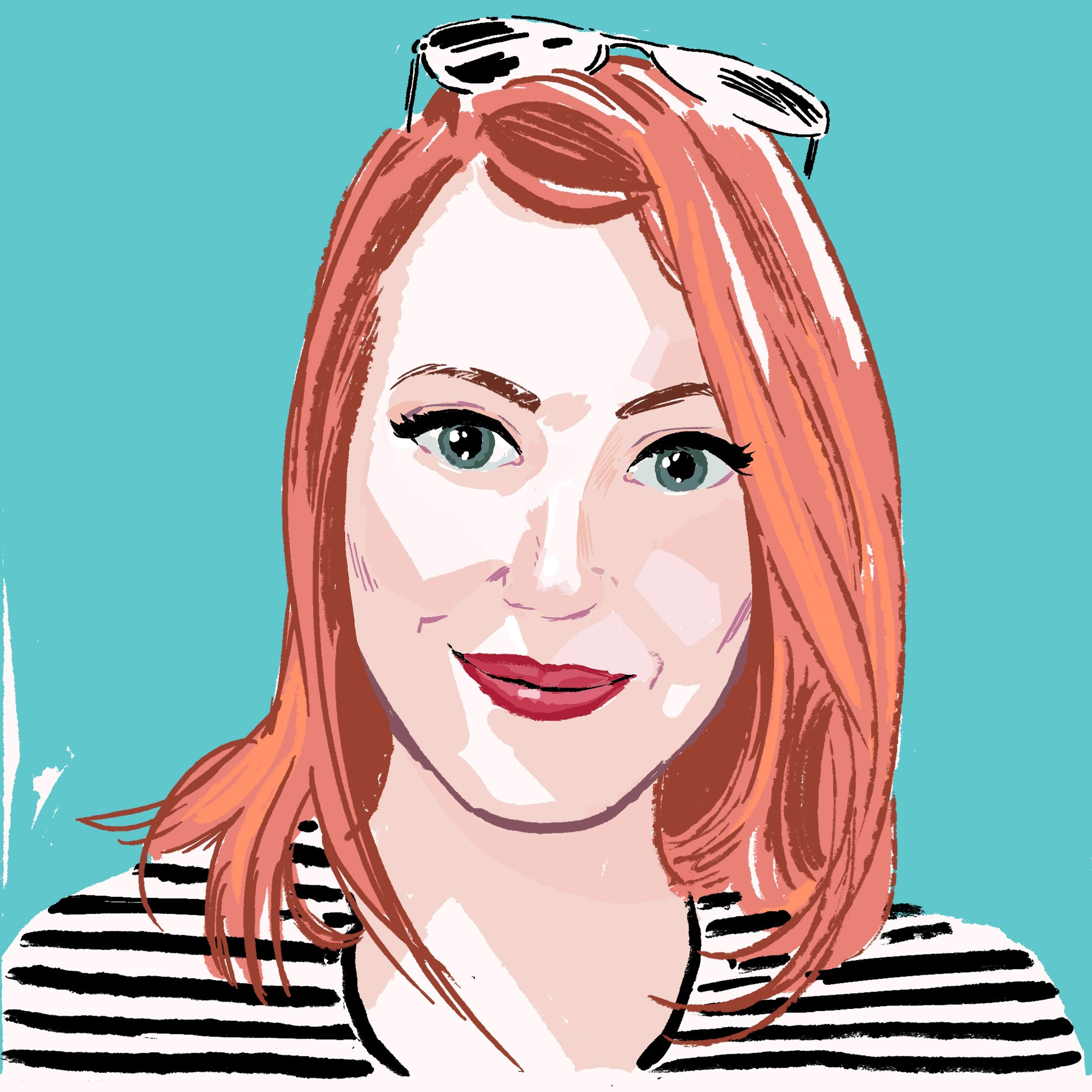
Heather Antos is a Senior Editor at IDW where she's editing all things Star Trek, creator of #SignalBoostSunday. She’s previously edited works for Image, Valiant, Marvel, Star Wars, Disney, and a bunch of creator-owned stuff, too and if that wasn’t cool enough, she is also a writer and artist.
 

Heather, can you take us back in time to when you first fell in love with comics and how that led to making it into a career.

I mean, I’m not quite sure if I can pinpoint “the” moment it happened. As my mom would say “she’s always drawn comics before she read them.” Creating and telling stories has always been part of my every being my entire life and illustrating my own stories and creating my own characters are some of my earliest memories.

In college I took an American Literature course where we had a segment on comics and graphic novels. It was then that I was introduced to SANDMAN and I was immediately in love with the possibilities of the medium. Not having grown up with a local comic shop, I didn’t read many comics outside of the weekly newspaper comics strips or various web comics. It was roughly around the same time that the Marvel films were really starting to take off and DC was about to launch the New 52 – a perfect recipe to get this future comics editor hooked on comics.

I always laugh at this, but I really like to credit the 2011 GREEN LANTERN film for truly motivating my passion for comics. Like most of us, I am a big Ryan Reynolds fan and was excited to see him take on hopefully a good (ha!) superhero role. I researched the stories the film was to be based on and devoured them. I became hooked on Geoff Johns’ run on GL from then on. And you can bet your butt that from the very first scene in the theaters I was “that” comic fan complaining about how “incorrect” everything about the movie was.

It wasn’t too long after that that I began looking into creating my own comics and self-publishing them. Coming from a background of film and theatre production, I really enjoyed the Behind-the-scenes work of building stories and producing. So naturally, the role of the comics editor (combined with my love of writing and drawing) felt like a perfect fit.
 

You’ve worked for a number of publishers, how has that affected your editing process over the years, and do you feel any of the publishers contributed to the development of your skills?

I’m extremely grateful for every project, creator, and publisher I’ve been lucky enough to collaborate with. As much as I never want to experience the grind of the Big Two™  ever again, I am extremely appreciative of getting to start my professional career working at one of the biggest (if not THE biggest) comics publishers. I learned so much about the importance of concise, clear communication, organization, boundaries, and most importantly…treating your team with respect. I learned a LOT of what NOT to do – and what kind of collaborator I never want to be. It’s easy to get lost in the daily grind of making comics, and it’d be SO easy to just phone it in and not care – we’ve all seen it – but as a book’s editor, you’re the captain on the field with the rest of the team. You can’t phone it in – you’re team leader. The job is to elevate and look out for everyone else you’re working with – and getting to make pretty cool stories while doing it!

At the end of the day, it’s important to evaluate what worked, what didn’t, and what we can do to be better on the next project – no matter the publisher you’re working for.
 

The grind is real and burns out so many talented folks. How have you dealt with it, and do you see a way of making comics that can avoid it? Or do commercial artists just need that overwhelming sense of pressure to create for publication?

I am HARDLY the best person to go to for advice on this, ha! I DEFINITELY take on way more work than I should…but I guess that comes with the territory of a creative. We’re passionate about what we do—and we LOVE doing it. It’s so hard to say no! Coupled with very unforgiving deadlines and rates at times, it’s more than enough to make anyone look at what we do and go “But why, though?”

Ultimately, though, as cliché as it is, it’s all about working smart AND working hard (but not harder than you have to!!!). It’s important early on to figure out what systems work best for you, when you work best, and with whom you work best. At the end of the day, even though, yes, making comics for a living is pretty cool and fun, we still need to treat it like a job. It’s what is hopefully paying the bills, after all.

For me, personally, time away from the desk is just as important as time spent at the desk and time management is key. Being aware of exactly how long on average it takes you to complete various tasks will help you better forecast your workloads, and in doing so will also help you figure out accurate rates.

But what I think is most important in terms of avoiding burnout? Being able to say “no” and setting firm boundaries. If you completed work for a client weeks ago and it was approved only for them to come back later and ask for revisions…you have every right to say “Sorry, I can’t.” Or “Sure, I’d be happy to, but my corrections fee is XYZ.” We’re trained to be “grateful” for any and every opportunity we get in this industry, and many bad clients will try to make us feel bad for advocating for ourselves. There’s nothing wrong with asking to be paid for additional services. Nor is there anything wrong with saying “Hey, I’d absolutely LOVE to work with you on this project, but my schedule simply doesn’t have room for another gig this month. I’d love to see if there’s anything available later we could collaborate on?” As an editor, any time a creator is honest with me about what they can take on (even if it means a “not right now”) tells me they are someone I WANT to work with down the line because they can communicate their needs.


How do you evaluate a project? What sort of metrics are you looking at/considering when coming up with the road map for a book or team’s betterment? And if a book is an immediate sales success, does it change your process?

I love this question in that I’m not sure I have a good answer for it, ha! There are some editorial practices that I’ve seen that have more cut and dry “this is what works, point plank period” – and there is nothing wrong with that – but for myself, I generally try to treat every project, every creator, as individuals. I see it as my to facilitate an environment where every creator can do their best work within the given parameters of a project. That means being able to shift and be as flexible as need be.

For instance, if I want to work with X creator, but I know that X creator is AWFUL at email and does much better with phone calls and texts…great! That’s how we’ll do the majority of our communication. Or if creator J reaaaaaaally wants to work on say Star Trek or Star Wars but I know they are not the strongest at likenesses, then why set them up to fail? Let’s find a project that’s focused on non-tv/movie appearing characters so they can excel! Or maybe I’ve been asked to come up with a 100-pg issue last minute that needs to be solicited in 2 days, and goes to print in 2 months – better think quick, who do I know who is fast, reliable, and can NAIL it? Or in that case, how MANY people do I know who can?

Immediate sales successes are nice, but 9 times out of 10 decisions about whether or not the particular book changes course are not up to the editor of that individual project.


Star Wars or Star Trek?

Yes.


I knew that wasn’t going to work with you! Anyways, for those that don’t know, you and I work together on a super-rad book called Slumber at Image comics (if you haven’t read it, what are you waiting for?!), how different is it working on a major licensed comic like Star Wars or Star Trek compared to a creator-owned book like Slumber?

There’s a saying all editors at Marvel know from Executive Editor Tom Brevoort: “No editor can make a bad story good, they can only make it better. All editors can make a good story worse.” 

No pressure, right? 

Because he’s not wrong. Especially when it comes to editors in charge of managing the IP for major properties and franchises. These editors are the Keeper of the Keys to some of the biggest storylines and characters that modern media has ever known, with some of the fiercest and most passionate fans out there. How’s the saying go? “With great power…” Well, you get it.

The main difference between editing for a major publisher versus a creator owned project is who it is that holds these keys, this ultimate power of final creative say when story disagreements happen. And they do happen.

One of an editor’s many responsibilities is being the first reader to any comic. They are the first set of fresh eyes to point out plot holes, continuity mistakes, etc. They are there to question the creators’ motives — the first person to ask why these characters are behaving in such a way, in such a scene. The first person to question and correct if things just don’t make sense. 

Will every creator always agree with the notes and questions their editor is making and asking? 

Of course not. 

That’s when the rule of “Keeper of the keys” comes into play. For a publishing house like Marvel, ultimately the editors in the Spider-Man office get final say on whether or not Peter Parker decides to go on a murderous rampage. And no matter how much the writer may think it’s the best idea that will ever hit comics, it doesn’t matter. Marvel holds the keys. 

On the flipside, I may have a note or suggestion on a script for SLUMBER, TIME BEFORE TIME, BLOOD STAINED TEETH, or ROGUES’ GALLERY, but if Tyler, Declan, Christian, or Hannah disagree, no matter how much I backup my claim, stamp my feet, or hold up a boombox above my head outside their bedroom window, they hold the keys. It’s their kingdom. I’m just an advisor.

Will an editor always make the best suggestion in their notes? Nope. Will they sometimes mislead a creative team? Sure. Editors, shockingly, are human and, just like creators, can have ideas that aren’t always the best, even with the best of intentions. It all goes back to that alchemy — sometimes the ingredients don’t always result in the way you want them to.
 

Circling back around to 2011’s Green Lantern film and of you being “that” comic fan complaining about how correct the film was when compared to the comics, do you find yourself in situations as an editor where fans complain to you about the direction of a given series?

I suppose it depends on how you qualify the word “fan”, doesn’t it? I have a personal philosophy that social media and the internet has changed how we consume pop culture – that very few people now watch with curious open minds and instead “hate-watch/read” for their hot take and “clicks”. It’s sad, really. We no longer consume to experience and enjoy; we consume to have an opinion. Is that what being a fan of something has turned into? I don’t know.
 

I ask everyone I interview…If you could only give one piece of advice, be it for editing or life, what would it be?      

“Don’t be a dick and do the thing.” Is my general go-to that applies to most generally any situation one encounters in life.

https://www.heatherantos.com/

Twitter/Insta: @HeatherAntos

Other Insta: @HeatherARTos

Interview with J.M. Brandt and Theo Prasidis

J.M. Brandt and Theo Prasidis are the writing duo behind SWAMP DOGS: HOUSE OF CROWS on Scout Comic's Black Caravan imprint. J.M Brandt  is currently working on several other unannounced projects, but you can read his short story, “The Welcoming Committee” in Vol. 3 of MIDNIGHT MAGAZINE'S anthology MIDNIGHT TALES. Theo Prasidis' new book BLACK MASS RISING is forthcoming from TKO Studios, and readily available from Image Comics is THE DOOMSTER'S MONOLITHIC POCKET ALPHABET.

J.M. Brandt

Theo Prasidis


J.M., Theo, tell us a little bit about how you both got into comics and what about the medium makes them perfect for telling your stories.

Theo: I never was much into comics. I grew up as a movie kid, devouring everything from mindless 1980s Van Damme action flicks, to Akira Kurosawa’s sophisticated epics. I loved cinema as a whole, so I studied to become a filmmaker. Along the way however, I realized that being a filmmaker, and having to deal with so many different people in order to tell a story, takes much more tenacity and resilience than I had. So I quit chasing that, and worked on different things. At some point I started writing a tongue-in-cheek alphabet about doom metal, a genre I was very much involved with because of a music festival I was curating at the time. I wrote it as a joke, really. I brought in Maarten Donders, one of the scene's most prolific illustrators, to do the art, with the ambition of printing a couple of copies and selling them at the festival’s merch booth. One night I got the crazy idea of pitching this to Image Comics, and within twenty minutes Eric Stephenson got back to me, saying they’ll put it out. That was it for me. Everything made sense. With comics I get to tell the exact stories I want to tell, without studio pressure, budget restrictions, or managing a fucking army. They’re the perfect medium for me. They’re downright liberating.

J.M.: I was a child of the 80s, and as such, grew up on cartoons and Toys’R’Us. I really cottoned early to “Superfriends” and was obsessed with the early 80s Marvel and DC action figures. So I guess that’s how I was first exposed. In fact, around the time I was 3 or 4 we would rent old VHS collections of the 1960s Marvel cartoons and I’d watched them so much that we wound up wearing down the tape on a couple. I still have vivid memories of the covers depicting Namor and Thor… to the point I could even tell you what part of the store they were in nearly 40 years later. Flash forward and my house is rather close to a shop called Golden Apple… and they had a bitchin’ mural on the side of the wall that fascinated me. It was Wolverine, unmasked, from the cover of Wolverine #1. I want to say an old iteration of the mural also had Red Sonja on it, but you can’t quote me on that part. As soon as I had money “of my own” as a kid, that was the first shop I wanted to spend it all in. I believe the first comic I bought on my own was a back issue of Moon Knight. I’ve been hooked, more or less, ever since. 

As for what makes them the perfect medium for storytelling? They give you a level of control over the narrative and the visuals of a story that no other medium can. The presentation can be as mundane or as abstract and experimental as you want. You control the pacing at an almost granular level. In a way it takes the best of writing prose and making a movie or TV and distills it to this wonderful sequential package.

Two writers on separate paths and an ocean between you. How did the writing partnership come about, and how did you know Swamp Dogs was the book you wanted to pitch?

Theo: At this point, I feel like I have told the story of how I met J.M. more times than how I met my own wife! But it’s totally worth it, because the whole thing was such a happy coincidence. We were both contributors at Screen Rant, the entertainment website, we were digging each other's articles, and we got talking. Music, movies, TV shows, our tastes were very similar, so we decided to work on something together. The idea was to make our own pop culture website, but then my Image book got announced, and J.M. came to me with a proposal: imagine if you will a Tombs of the Blind Dead comic book, but instead of rural Spain, it takes place in the swampy South, and instead of Templar Knights, you have undead Confederates. To say that I was hooked, would be an understatement.

J.M.: What he said. It’s a pretty interesting meet-cute, though, isn’t it? Swamp Dogs, at least a very distant form of it, was an idea that I’d been unable to shake for nearly a decade when I brought it to Theo to work on it together. I needed a like-minded soul to help me give birth to it. Theo was the man for the job.

A comic set in the south, undead confederates, scantily clad women. I know we only have the first issue out, but has there been any…controversy that either of you have had to address? Anything either of you would like to state for potential readers that might be cautious to pick up a book involving undead confederate soldiers?

Theo: Dealing with the controversy of the subject matter was one of our earliest conversation topics. We’re forward thinking people who are very aware of how hurtful certain themes can be, so we wanted to play this absolutely right. We did our best to portray the Swamp Dogs like the truly remorseless monsters that they are. There’s not an ounce of humanity in them, no inkling of redemption or sympathy. They’re evil to their very core. And in the wake of the Trump administration, and all the horrific things we’ve seen happening in the States over the past few years, they also work as great stand-ins for systemic oppression and violence.

J.M.: I wouldn’t call it controversy, but there have been some concerned voices both on Twitter and in person at conventions. Some have been concerned by our portrayal of queer women. Some have been concerned by our portrayal of race. In every instance, I listened to those concerns and responded as thoughtfully and sincerely as I could. We’re not out to misrepresent any group. Is there overt sexuality coming from the female leads? Absolutely. This is a grindhouse homage. This is a genre book at its core. But our thinking is that it is not innately a denigrating portrayal just because of the sexuality. These women are human beings, and there are complex goings-ons, a REAL romance and REAL emotions, that also get portrayed. And we are always open to listening to thoughts from the communities that we are representing in the book, and working to keep things balanced.

Are you working on other projects together? Any solo works you can talk about yet?

Theo: Well, we have a number of exciting things coming up in the Swamp Dogs universe, so we don’t plan to stop working together anytime soon. I have a new TKO Studios book that’s just been announced, an original Dracula-themed horror/fantasy graphic novel called Black Mass Rising, featuring some striking art by Jodie Muir. And I’m working on an awesome project with animated film director and illustrator Adrian Dexter, who is known for his cover work for the heavy psych/prog band Elder. Can’t say much about this one yet, but it’s one of those projects that keep you up at night. So yeah, I’m pretty psyched!

J.M.: There are proposals in. There are parties interested. But it’s one of those “if I told you I’d have to kill you” type situations. But I am currently writing a twisted short story about a modern day problem and how being alienated from your neighbors can lead to some pretty disturbing circumstances. That’s probably what I’m most excited about finishing next. It’s called, “What Are They Doing Up There?”

These all sound like awesome projects! As you both know by now I’m a bit of a horror hound myself, and while these aren’t all entirely horror projects, what is it about the dark that has you both creating in it?     

Theo: I don’t know, man, I ask myself the same question all the time, haha! And I did try to develop a couple of more children-oriented projects recently, but I can’t seem to be able to wrap my head around them. I keep coming back to horror. I mean yeah, horror stands as a great metaphor for our deep, personal traumas, and our collective existential anxieties, and all that. But there’s more to it. I guess there’s something comforting in horror and fantasy. Like the world makes much more sense if there are monsters in it. I just can’t think of a better place to lose yourself in, than a good horror story.

J.M.: I don’t know exactly what compels me. I mean, The Count was my favorite Sesame Street Muppet (and not because of the math) and my first dream job (and current dream job) was being a Ghostbuster. Some people are just drawn to horror. It takes the right mix of nerves and grit and sense of humor in life, I think. Fiction is powerful because it allows our brains to play in the realms of the unreal and, at the end of the story/movie/game, we are safe and unharmed (except maybe our psyches). So why not really push the limits of the unreal and make it something catastrophic and violent beyond measure?

For Swamp Dogs, you both assembled the creative team. What goes into your thought process for finding the right people to work with? With different projects is it the same process?

Theo: The process is always the same to me: figure out the vibe I want the project to have, and find the team that will absolutely nail it. It doesn't matter where they are from, or how big a name they are, or how many books they have put out. If they’re the right people for the project, they get the job.

J.M.: As a creator and writer, I see the images of what I am making before they’re committed to paper. From there it is surprisingly simple to see whose work (or potential in their work) fits most closely to what I see in my mind’s eye. That’s not to say that it’s a simple process, though. Like with Swamp Dogs, Theo and I went through dozens of artists and letterers before figuring out whose styles would mesh the best with what we wanted to accomplish. We just got insanely lucky that we wound up with our first choices!

I ask everyone I interview…If you could only give one piece of advice, be it for writing or life, what would it be?      

Theo: There are three pieces of advice I usually give that apply both to comics and life. One, take your work seriously. If you won’t do it, no one else will. Two, keep on trying. It’s easy, even tempting, to just quit, but trust me when I say that there are people out there who are going to believe and invest in your vision. You just need to find them. Three, and hear me out on this one: don’t be a dick.

J.M.: If you believe in something and love it… then there are other people out there that will be picking up what you’re putting down. So don’t doubt your vision.


Theo:

https://www.theoprasidis.com

https://www.facebook.com/theo.prasidis/

https://twitter.com/TheoPrasidis

https://www.instagram.com/theoprasidis/

J.M. Brandt:

https://twitter.com/MRJMBrandt

https://Instagram.com/j.m.brandt

https://facebook.com/MrJMBrandt


Interview with Gabriela Downie

Gabriela Downie is a comic book letterer, cover artist, character designer, and she's setting her sights on video games. You might know her work on Harleen, RWBY, and Punchline.

After a bit of investigating, it turns out you and I share a similar entryway into the world of comic book lettering via DC’s Prepress department. Is that where you got your start in comics? Have you always been interested in comics?

Prepress at DC Comics was my “break-into-the-industry” moment. To get hired I had to pass a competency test, portfolio review and a few interviews. So when I got the position I felt validated as a professional artist.

I figured if I worked my way up, I would eventually end up designing the DC Heroes in the Injustice fighting game franchise, thus why my website is full of colorfully rendered character illustrations. My original goal was to become a video game concept artist. Now I’m using my experience in both fields to chart my own course. 


Now, there are some letterers who will read “work my way up” as a dig against career Lettering, but I when I went from Pre-press to Lettering, I saw it much the same way. How do you see yourself using lettering to help chart your path into video games? Do you worry a potential employer will see Letterer on your resume and that will sound the death knell?  

Every skill we artists cultivate serves us, not the other way around. Lettering has helped me master typography and graphic design, and it has already opened doors to television and video/stream content, as a graphic designer, for me. 

If lettering is the field an artist wants to stay in, more power to them. 

That doesn’t grant them the authority to guilt-trip, or “humble” other artists who want to expand or discover other opportunities, because that’s toxic. 

The video game industry has a lot of work to do on their work-culture as well, and I don’t think anyone should chain themselves to a toxic work environment. 


You’re a letterer, but I went to your website and I don’t see any lettering. Instead your website showcases wonderful character designs. Most of them beautifully rendered in full color. So, why exactly are you lettering comics, and not doing covers? 

My first Cover just got published actually! Helm GreyCastle Issue 3! But you’re not wrong, took me long enough, right? Well that’s because gatekeeping is a persistent problem in comics. They’ll throw any excuse in our faces to keep us from participating. Luckily Henry is a real-life hero, with a big heart and two functioning eyeballs.
 

You’re work first caught my eye on Harleen, but I’m seeing your name pop up more and more. Can you talk about any of the new projects you’re working on? Are you juggling character design and lettering?

I am currently producing my own original graphic novel. A one-woman-army undertaking, if you will. Don’t ask me when it’ll be ready, art takes all the time it needs.

As for works of art ready to be consumed and adored, I offer these wonderful projects I’ve had the honor of lettering:

Helm GreyCastle by Henry Barajas

Thirty Three by Juan Ponce

Twin Blade by Jarred Lujan

These creatives are the future. So much heart and authenticity in their storytelling, and action! I know talent when I catch myself reading the story as I letter, and these three stories all distracted me,  ha!

Did I mention they were all Latinx/Latine talent? These books bring fresh new perspectives that’ll resonate with all generations. 


Can you tell us more on your own graphic novel? Is there a place we should stay tuned for more details? Now that you mention it, why is it important to you that those projects are Latinx/Latine talent? 

For my graphic novel: follow my social medias for more info on that. Like I said, it’s a one-woman-army undertaking, and I’m still drawing the thing!

As for the Latinx/Latine question…We are not here to “profit-off” of brown/minority stories. We ARE the stories, and when we’re empowered to share our voices, everyone wins. Our Ancestors win, our children and grandchildren win, and consumers from different ethnic/cultural backgrounds win as well, because of education and familiarization. It’s 2021, ignorance is a liability and there is no “un-ringing” that bell.


From Pre-Press artist to letterer to cover artist with video games in sight all the while doing character designs AND working on your own graphic novel. How are you juggling it all. What is your workflow like?  

I use the Adobe Creative Suite, more specifically: Photoshop, Illustrator and Indesign. The key to “juggling it all” is time management. That means being honest and realistic with myself on how/when I clock in the time for each. That being said, I’m learning to value myself and my self-care. Rest and work time are almost equal, so I need to keep my workload cart updated constantly. 


Earlier this month you made some posts to your socials with the hashtag #COMICSARESTILLRACIST I read it on your IG story but readers of this can find it pinned to your Twitter. It was a well-written piece and you take ownership of it as being ‘your truth’, while I can’t relate to your story in terms of race or gender (I’m a white male in a predominately white male industry), I certainly share your sentiment on career growth, pressure, and gatekeeping. Have you faced any blowback from your statements? Has this experience made you think differently about lettering, or comics in general?

I was made to feel guilty for “throwing people under the bus” but it’s nothing personal! At the end of the day, the numbers DON’T add up to anything healthy, or fair. DC knows it gets the most “bang for it’s buck” by gaslighting the ever-loving-shit out of talented, sensitive, LOYAL creators. It’s an abusive relationship for all artists involved, they’re just too broken and BROKE to speak their truth. It’s ok, I am here to beat the drum. Loudly. Absolution won’t be granted until we get paid better, end of discussion.


So this sounds more financial, than racial. Wouldn’t a better hashtag be #COMICSARESTILLEXPLOITINGCREATIVETALENT what am I missing that makes this racist? And do you feel it’s about corporate policy, individual editors, group editorial policies, or just the way things are? How can we as a comics community fix it? 

It’s nice when race and economics can be compartmentalized separately, but for minorities, it’s the same thing. Employers that claim to be an ally for minorities, and profit from us, but mistreat, underpay, and exploit our time and energy,  or threaten to, or follow through with ending our careers for petty reasons, are racist hypocrites.  

The problem in the comics is racism/elitism. 


I ask everyone I interview…If you could only give one piece of advice, be it for lettering or life, what would it be?      
 

Real Heroes 

Exist…in

Real Life.


The characters in media are saturated and seductive, but they are not real. You, the listener, are real. I am real, we coexist in this reality.

How you treat others, and how you allow others to treat you, is the only thing that has meaning.

Don’t work with people who exploit you. Don’t worship entities who are cruel. In real life, the only hero enforcing kindness is YOU. The only hero enforcing fairness, is us. We must demand it, and nothing less.

Website: https://www.harmzart.com/

Twitter: @HARMZ_sh

Instagram: @HARMZ_SH, @GabrielaDownieInComics, @harmz.art @PELIGROSA_cosplay

Interview with Aditya Bidikar

Aditya Bidikar is the letterer on Home Sick Pilots, The Department of Truth, Coffin Bound, Blue in Green, Hellblazer, and if that’s enough to make you envious, I don’t know what to tell you. 

Aditya.jpg


Aditya, I always like to ask my interviewees how they got into comics and what it was that made you want to make comics?


I got into comics as a writer – I’d been writing prose since I was about 12, and I’d always read comics, but that was limited to Archie, Tintin, and Indian publications like Tinkle and Raj Comics. I came across one of those “Comics Aren’t For Kids Anymore” articles in the film magazine Sight & Sound, and that pointed me towards books like Sin City, Watchmen and City of Glass. It was when I read the City of Glass graphic novel adaptation that I realised how much there was to explore in the comics format as a writer.


I started making my own comics with a couple of Indian artists – this would be around 2008-2009 – and since there was no Indian letterer to my knowledge, I had to teach myself how to letter a comic. I found it to be a very interesting craft – it’s such a specific mix of design, typography and calligraphy, and the letterer gets so much control over how the comic is read. So I quit trying to write for a living, and leaned into lettering. It’s only got more interesting to me since then.


Interesting that you went from wanting to write for a living to leaning into lettering, I’ve seen you express a desire to letter less and do more with writing recently. This is a sentiment we share but I’ve never expressly said it in public before. What do you think is behind this shift for you?


The primary reason I quit writing in the first place was that I couldn’t find a balance between writing for myself and writing for money. I found myself losing what was interesting to me in the first place about writing, and investigating every new idea for commercial viability. That struck me as an unhealthy relationship with the writing, at least for me, so I focussed on lettering because it’s something I enjoy on the craft level – even a bad day lettering is not too bad, while a bad day of writing could be soul-crushing.


I took time off the writing – I think I had two or three stories published in the last eight years, and those were written for pleasure. I spent the last eight years investigating that pleasure – what kind of stories genuinely interested me, what did I want the process to be, and so on. Getting back in touch with the love of writing that had made me write one-and-a-half (terrible) novels as a teenager just because it was a fun thing to do.


I feel I have a better idea of those things now, and because I have a day job that I also love, I can write without worrying about getting things published or making money off the writing (though that’d be nice), and what I write is that much more authentic and honest for that. Now that I have a better grasp of what I want to do, it feels like the right time to put more time into it.


What’s your approach for creating a lettering style on a given book?


The first thing I look at when I’m creating a lettering style is the line quality of the artist. I want to do something that matches that, for one thing. Then I try and choose a font that has a similar line quality and weight, but which also suits the mood and tone of the book. I create 3-4 options, combining different fonts and balloon styles, starting with a straightforward style and getting increasingly wacky. The idea is to give the team something to explore – it’s fine if one of the styles is entirely off-the-wall if we like one element of it enough to use it in a different style. Then I sit with the team and we mix-and-match and come up with something we all like. (I follow the design credo of never offering an option I wouldn’t be happy seeing on the book.) Sometimes, though, I see a book and I just know what it needs, and for those (Coffin Bound, for example), I’ll send a single option along with an essay-length email making a case for it, to which I usually get the reply, “Calm down, Bidi. If you feel that strongly about it…”


You do some books with traditional hand lettering—despite that being awesome on a purely craft level, what the hell is wrong with you?!—and how do you decide what book(s) you do that for?


Haha, the honest answer is, I wanted to learn how to hand-letter, and I find that deadlines offer me a bracing cocktail of clarity, focus and sheer terror. So it was easier to declare I would hand-letter a book, and then figure out how to do it.


As with a lot of books I take on, how I decided to do it is more about the people than about the book. Few writers are okay with me saying, if I’m hand-lettering this, I’ll give you digital placements, and that’s the last time you can edit the text. Ram, on the other hand, just went, well, if it’s going to be worth it, sure. And once we’d decided that, he gave me the space to actually learn how to hand-letter, which meant a lot of initial failure. Ram was the one who kept saying, look, we have time, and if you find you can’t do it, we’ll go digital, but for now, why don’t you keep exploring?


But I offered to do it for Grafity’s Wall and Blue in Green because I thought that digital lettering would take away from what made these books special. As Ram is fond of saying, certain books need to look like somebody sat down and made them by hand – crafted them – rather than produced them. And there’s a quality to hand-lettering that’s not present in the most organic-looking digital lettering. For these two books, it was that combination of the books and the people involved.


Like other letterers, though, I am obsessed with making my process more efficient, so for the second book, I figured out a digital hand-lettering process that retained what’s interesting about hand-lettering while being more editable and taking less time. Hopefully, this’ll make it less expensive for prospective clients, and perhaps there’ll be more hand-lettering in my future. Even now, I’m planning to hand-letter at least one graphic novella in 2021, both because the artwork feels like it needs it, and because the writer (for once, not Ram) felt strongly that we should try and hand-letter it.


Philosophically speaking, comic-book fonts have democratised both comics and lettering, and I think that’s a good thing, because I started out ten years ago (whew) as a digital letterer who couldn’t have hand-lettered at gunpoint. But as the form progresses, we shouldn’t lose what was great about the old way of doing it. Right now, other than John Workman, I can’t think of anybody who hand-letters comics who is a full-time letterer – Dustin Harbin, Kurt Ankeny, Galen Showman, Stan Sakai are all artists who occasionally hand-letter comics for themselves or other people – and I think it’s a pity that when people want hand-lettering, they don’t immediately think of professional letterers. The next step for me, I guess, is to be good enough to letter on the board. More terror. Yay.


You’re—in my opinion—one of the best letterers around. Part of that I think is due to your respect of the craft itself, it’s history, and your ruminating on what good lettering is going forward. Where do see the craft in five years? Ten? Are you still a letter that likes to write, or a writer that used to letter?


Thank you so much, and likewise – you have been an inspiration to me, and I love how versatile and investigative you are in your work. Each book you do is distinctive and interesting in its own way.


Speaking in general, I feel like comics lettering five years from now is going to be much more alive and energetic as a field. You can see it in digital colouring right now – the kinks of how things need to be done on a basic level have been figured out, and the artistry is showing through. Five years from now, I see lettering being the same. In one direction, more people will be hand-lettering – digitally and on paper. At this point, I think I’ve managed to get the method down to be as cost-effective and production-friendly as possible, and I’m sure people like Harbin and Ankeny have their methods, so it’ll continue to get easier. In the other direction, what digital lettering means will also evolve. The direction for that lies in things like the contextual alternates that Nate Piekos is using in his recent fonts, and in Photoshop integration for sound effects the way Hassan OE and Thomas Mauer use it. Lettering in Illustrator, we are limited by how much we can touch the art, but I’m sure the process will evolve and we’ll see far more organic things happening digitally. The basic “house-style” work – I don’t see that changing or evolving much in that time, but around the edges, I think things are only going to get cooler and more interesting.


Ten years is more difficult to gauge. Either we’ll get the credit and recognition we feel we deserve, or it’s robots all the way. Who can tell.


Personally, the other aspect of my cutting down on lettering work (other than writing) is that I want to learn type design more systematically. I’ve been playing with the software for a few years now, and I’ve made 4-5 fonts that I use in my own work, but I think it’s time for me to get serious about it, do some learning, and set up my own foundry. Hopefully five years from now, that’ll be in full swing, and you’ll see my fonts being used in comics alongside those from Blambot and Comicraft. Ten years from now, I’m a hermit who lives entirely on the passive income that generates. Fingers crossed.


But I definitely see myself as a letterer who writes, because I can’t make writing my main thing again – it’s too stressful, and I’d rather do it for love.


Can you walk us through your process for hand-lettering? Don’t spare any nuts and bolts.


I have written detailed accounts of the process for both Grafity’s Wall and now Blue in Green, but those are intended for non-letterers, so while you get a sense of my aesthetic exploration from those, I haven’t written about the actual nuts-and-bolts process, and I’m delighted that you asked, because I’m going to assume it’s all us letterers here, and I don’t have to hold back.


Grafity’s Wall:

I’ve written about how I landed on the right size and style in the process post, so I’ll skip that and go straight to how each page was lettered. (You can check that out here: https://unbound.com/books/grafitys-wall/updates/writing-between-the-lines)

I would get the tiff file once the inking was done, and I would add crop marks to the edges, blow it up to A4 height, and then knock out the black and replace it with a light cyan (this is why I preferred working on the inks rather than the colours). I’d print that out on cartridge paper to letter on it.

In the meantime, I’d do a digital placement file for Ram (yes, I’d be lettering each page twice, but this version was always really sloppy) using a font that’d take up around the same amount of space (I think it was J Scott Campbell Lower from Comicraft). We’d use this to edit the dialogue, because we couldn’t fix anything other than minor typos once the book was fully lettered.

Based on those placements, I’d draw guides on the printed-out version of the page (this was when editorial placements suddenly started making sense to me), and I’d pencil out the dialogue to make sure I wasn’t covering faces or anything important. Then I’d letter it, and this bit didn’t take too long – it was everything that came afterwards that was the real pain in the ass and I constantly wished we had production people for this like in the old days.

Once the lettering was done, I’d scan the lettering, knock out all the cyan so only the black was left, and I’d use the crop marks to resize this down to comics size and align it with the page in Photoshop. Then I’d set the lettering layer to multiply (so the white would disappear, and the black would overprint correctly – this was also when I’d apply a threshold action to make sure the black was 100K and not rich black), and I’d fill in the balloons with white on a layer beneath that (this was my least favourite part, and I’d always make sure to do this over colours, because there’s nothing quite as annoying as the art showing through bits of your balloons and then having to check every page).

(The sizing up and sizing down was for two reasons – first, Anand drew the pages at A4, and I wanted to react to the art as he’d drawn it, and sizing the lettering down makes it looks smoother too.)

I drew the sound effects on paper too, so I’d take those to a separate layer and colourise them and play with them digitally so they looked organic. Ideally I would’ve liked to hand those to the colourist to mess with, like you’d do with proper hand-lettering, but I don’t think the process could’ve accommodated that.

The chapter titles were all digitally done in Photoshop, and I convinced myself that was okay because old-timey hand-letterers would occasionally use printed type in their work. Still, one of those was digitally hand-lettered and the other was a font I cobbled together based on an old Bollywood movie poster, so I like to think I wasn’t slacking off.

Once all the pages were done, we did a round of catching typos and egregious mistakes, and I still have a piece of paper somewhere with what looks like random words and phrases that I then scanned and used to make corrections.


Blue in Green:

Again, details on the aesthetic choices are in the process post, I’m just happy you used the words “nuts and bolts” and let me run wild. (And you can check that out here: https://adityab.substack.com/p/strange-animals-26oct2020-feeling)

I lettered this on the iPad, and used the time between the two books to get any kinks out of the process, so this one was smooth sailing.

I made a page in Photoshop with guides spaced at 2mm height with 0.5mm leading (I tend to letter inside the lines, so the usually recommended 1mm leading was far too tall for me), and I exported that to Sketch on the iPad. We did digital placements again (this time using CC’s Ask for Mercy), and after Ram’s notes, I used that to get a sense of the stacking while I lettered on the iPad. As I noted in my process post, some pages were lettered before the art was done, and for those, I had to guess at the stacking and then fix it while compiling in Photoshop later.

I tested out a bunch of custom brushes and tweaked them endlessly to get the right one. I did a few print tests before we started making the book to make sure it didn’t print too thin or anything like that.

Once the basic lettering was done, I used Photoshop Sketch’s integration with Creative Cloud to access the files on my laptop. There, I’d downsize the lettering from 600dpi to 450dpi, to match the art dimensions and, again, so it smooths out. By this point I had a nice little Photoshop action set up that’d create all the layers I needed for the work. I’d paste in the letters, and use the pen tool to draw balloons. Then I’d go over those to create the borders (as you can see in the book, the balloons and the lines are deliberately slightly misaligned).

As you can see, the process not only had fewer steps, it was also shorter and more flexible. With Grafity, I think I could manage 6-8 pages a day, while with Blue in Green, it was more like 10, which is getting close to my normal lettering speed.


I ask everyone I interview…If you could only give one piece of advice, be it for lettering, or life, what would it be?


This is advice for creative people that I think applies to everyone else. It’s fine to have ambition and goals with what you do, but when you’re trying to decide what to dedicate your life to, make sure you enjoy the daily grind of it. It’s no fun if you want to be a novelist but hate sitting down and putting the words in. Results are occasional, but the process is daily. Make sure you like the process.

https://adityab.net/lettering/

Interview with Ryan Cody

Ryan Cody is a comic book artist, most recently turning heads with his colors on Family Tree. He also colors Hero Code for Jamie Gambell, an indie superhero comic, as well as an unannounced project coloring over artist, David Hahn.

ryan_bio.jpg


Ryan, how did you get into comics and what led you to making comics?


When I was 10 or 11 my dad would take me to a barber that had comics on the tables while you waited. I'd read old issues of Iron Man and Spider-Man, and that led to picking up random issues at the convenience store whenever my parent's would buy them for me. When I discovered my first comic shop, House of Armands, in Oceanside, CA, I really just fell fully in love with them at that point. Uncanny X-Men and Excalibur were the first series I followed monthly.


I always wanted to draw comics, but life got in the way and I eventually stopped reading them altogether in the late 90's. Around 2004 I saw an issue of Powers and something about that book hooked me and got me back into wanting to make comics again. My first book, Villains, was published a couple years later by a small publisher called Viper Comics. I was very green, and it shows in the work. It was the first long form sequential work I had ever done but it still felt great to be published.


Did you always want to become a colorist?  


Not until recently. I've always been a line artist who has colored his own work for the most part. A few years ago I started realizing that coloring was my favorite part of the process and began to explore that direction the best I could. I started by coloring pin-ups of my friends work and then an occasional short project or pitch pages for small indie books. Eventually, Phil Hester gave me chance on an anthology book called Shock Vol.2. for Aftershock Comics. Those 5 pages led to working on Family Tree.


How do you approach coloring a comic? Do you have the same method for every book? Please feel free to get into the nuts and bolts a bit!


My process as far as page set-up and lighting is very much the same on most projects. I flat color the pages in basic colors, no different than how we all colored when were 6, or sometimes I pay someone to flat them for me. Then I lay in my shadows and highlights and any special effects lighting. At that point, my main focus becomes the overall color palette of the page. The most important thing that changes between each project is the color and “mood” the creators want it to have. For Family Tree it's supposed to be desaturated and gloomy, except when there are scenes that need to pop and be lush and green. I try to give every scene its own color mood.


For example, a calm scene set outside at night will have blue and purple hues as the main color focus. Conversely, an action or tense scene set at night might have more of a purple and red color focus, to highlight the tension or aggression. Once colorists saw red skies for night used on Batman: The Animated Series, we all filed that one away for future use.


A scene set in a doctor’s office or an office building, places where people generally don’t like to be I’ll color in yellowish greens, almost a sickly pale color. In my opinion environment and mood should dictate color, not necessarily realistic and typical colors.


Do your roles as artist and colorist ever conflict? I know from my own experiences that lettering and coloring tend to have some very tight deadlines, and I can attest to how fast you can color a book, but do you ever have a lineart gig and a coloring gig with the same deadline? If so, how do you make that work?


Most of my projects that I have done all the artwork on have had flexible deadlines so it’s never really been a problem. Much like my coloring style, my line art style is pretty simple as well, so I can work fairly fast if I need to and can usually pencil, ink and color a page in a day, unless it’s very detailed.


Time for some tough questions! Do you have any favorite horror movies you like to watch this time of year? Do you put on spooky music when you’re coloring Family Tree?


I’m not really a big horror fan honestly. Usually this time of year I’m gearing up for my annual re-watch of Band of Brothers in November. I’m a big podcast and sports guy, so I usually have a soccer game on, or a comedy podcast going when I’m working. I’m not super deep into soccer, but I find the pace and commentary very soothing.


I ask everyone I interview…If you could only give one piece of advice, be it for lettering, or life, what would it be?      


Creating comics is work. If you get into this business thinking it's all fun and working from home and being your own boss, and having insane creative freedom, you're going to be sorely mistaken. If your goal is to pay your bills making comics in any form, the sooner you treat it like a job and understand the hardships that come with it, the better.

https://super75studios.com/
www.instagram.com/ryancody75 (@ryancody75)